技术实践
如何画一根优雅的0.5px细线
边框在网页中是常见的一种样式了,虽然不把它处理为0.5px看上去没毛病,但是实际情况在移动端看上去0.5px比1px看上去要精致很多

羊先生2020.02.13 · 1 分钟阅读 · 42 阅读
边框在网页中是常见的一种样式了,虽然不把它处理为0.5px看上去没毛病,但是实际情况在移动端看上去0.5px比1px看上去要精致很多
渐变
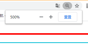
实现原理:把元素的伪类高度设为1px,背景渐变,一半有颜色,一半透明
html
<style type="text/css">
.box{
  margin: 10px 0;
  border-bottom: 1px solid red;
}

.box1{
  position:relative;
}
.box1::after {
  content: " ";
  position: absolute;
  left: 0;
  top: 0;
  width: 100%;
  height: 1px;
  background-image: linear-gradient(0deg, transparent 50%, #00BCD4 50%);
}
</style>
<body>
    <!--1px-->
    <div class="box"></div>
     <!--0.5px-->
    <div class="box1"></div>
</body>效果如下,浏览器放大500%,可以清楚看出1px和0.5px的出去,如需查看CSS linear-gradient() 函数
transform:scale
利用CSS3缩放
html
<div class="box"></div>
<div class="box2"></div>
写法一
css
.box{
  margin: 10px 0;
  border-bottom: 1px solid red;
}

.box2{
  position: relative;
}
.box2::after{
  content: "";
  position: absolute;
  left: 0;
  top: 0;
  z-index:1;
  width: 200%;
  height:200%;
  border-bottom:1px solid #ffeb3b; // 如需4边,去掉bottom即可
  transform-origin: 0 0;
  transform: scale(.5, .5);
}
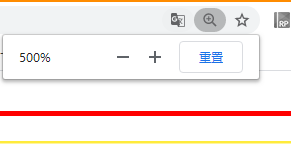
效果如下
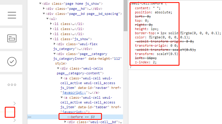
写法二 WEUI源码
css
.box{
  margin: 10px 0;
  border-bottom: 1px solid red;
}

.box2{
  position: relative;
}
.box2::after{
  content: " ";
  position: absolute;
  left: 0;
  top: 0;
  right: 0;
  height: 1px;
  border-top: 1px solid #673ab7;
  color: #8bc34a;
  transform-origin: 0 0;
  transform: scaleY(0.5);
}
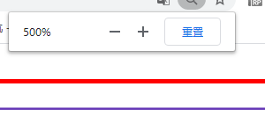
效果如下